It’s finally finished! Our main bathroom was the one room that took us an incredibly long time to finish designing. When I say “we”, I really mean just me. I was such a pain in the butt with this room. I was all over the place with inspiration pictures and changed my mind several times along the way. God bless our designer, Toni. She has been so incredibly patient with me throughout the whole design process, but especially with this room.
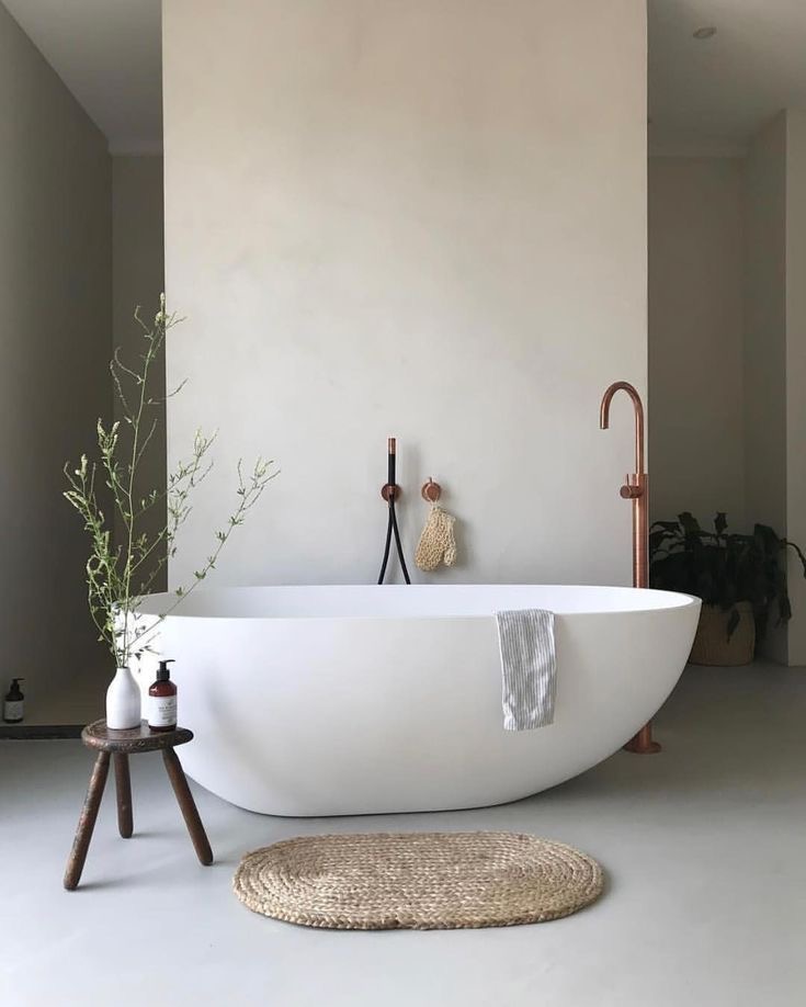
Let’s start with one of the original inspiration photos because it is truly one of my favorites. This full walk-in shower was similar to the one we had in our New Orleans home and we loved it so much! The layout in the Nola bathroom was just slightly different than this, with the tub in the middle of the room. For our Kentucky house, we have a smaller footprint in the bathroom and so we decided to push the tub against the shower wall, like it is in this image and I actually prefer it this way. Doesn’t it create a gorgeous moment? I love a good design moment.
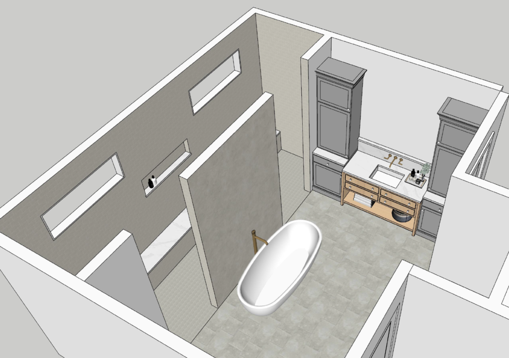
You can see how we brought our inspiration to life in this rendering from Toni and we changed up the style just a bit to make it feel more like us. Unlike the smooth textured walls like we see in the image above (which I tried to go for at one point), we decided to use a smaller tile on the inside of the shower and a plaster finish on the wall behind the tub. In the rendering below, you can also see Larry’s side of the vanity. This center piece will be a furniture-style stained wood vanity in between two towers that will be painted creamy white. We had tower storage similar to this in our New Orleans house too and it is so useful!
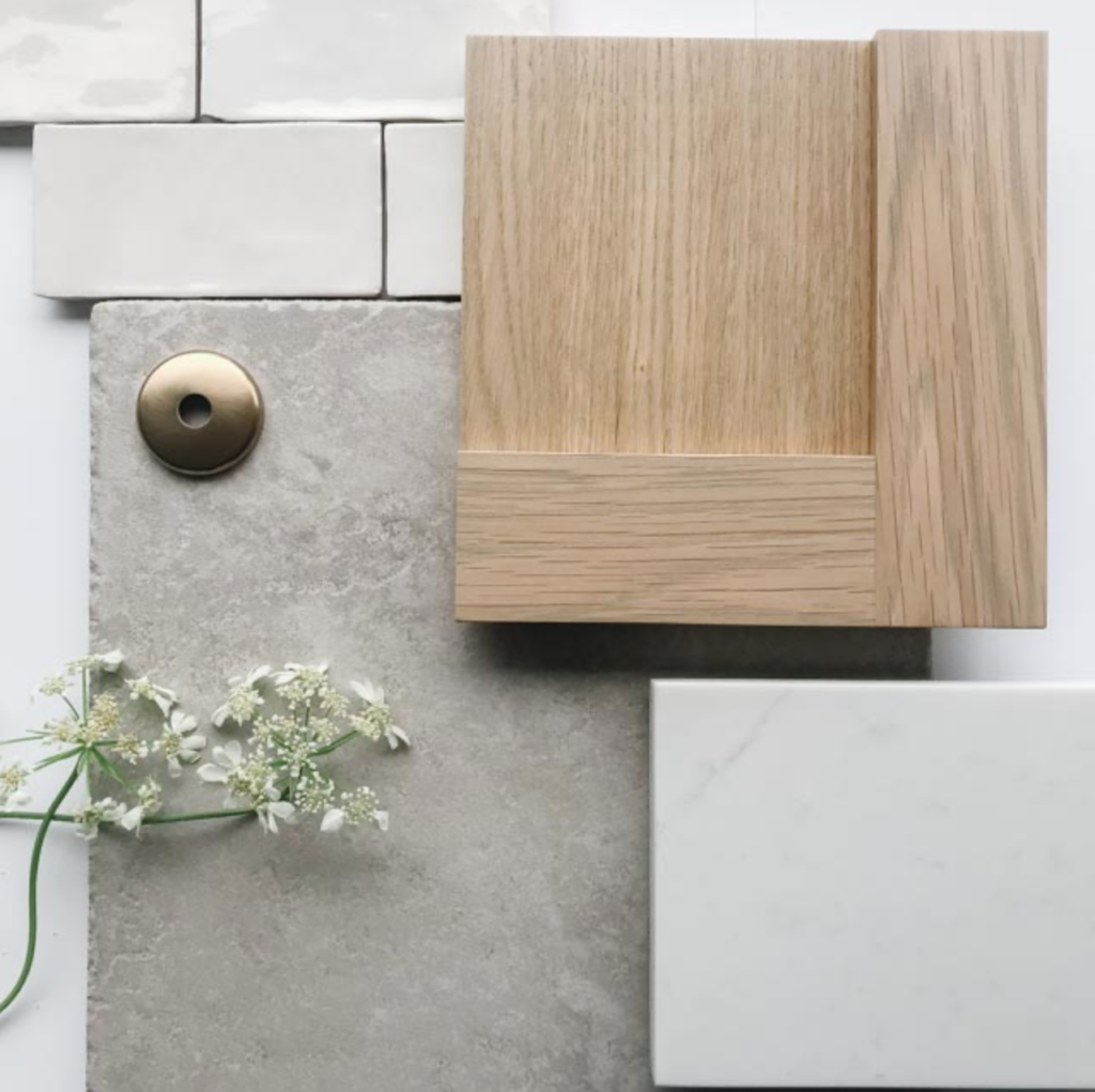
You can get a good idea of the mood with the samples below – although we’re still working on the perfect white paint color for the cabinets. These aren’t the exact samples for our bathroom but a lot of it is the same. The smaller tile is going to go on the inside of our shower (God bless our tile guy) and the wood stained vanities will be this gorgeous wood stain. The floors won’t be this exact tile, but something very similar. Now, let’s get into some fun details that we added in later!
This bathroom from Amber Designs quickly became our new favorite inspiration picture for this space. Three things in this image immediately popped out to me: the textured shower tile, the stone flooring, and the fluting detail on the vanity fronts. We recreated a version of the shower tile when we selected the smaller tile, and used a similar stone-like tile for our floor.
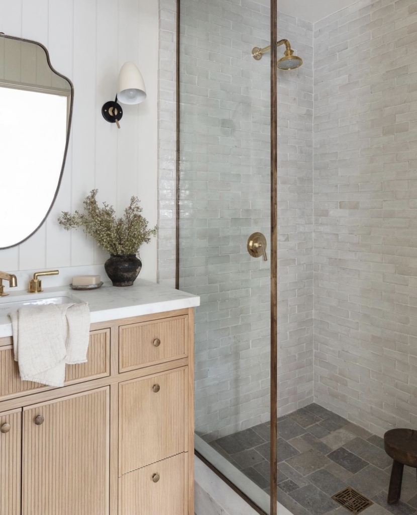
The fluting detail we thought would be gorgeous to use in a select few places, like on the top drawer of the makeup vanity (as seen in the rendering below). In this image below, you can see the full layout of the bathroom including the two his and her vanities and the third makeup vanity tucked away in the little nook there. I think overall, it flows really well and won’t cause a lot of traffic for Larry and I going in and out while we get ready for a date night.
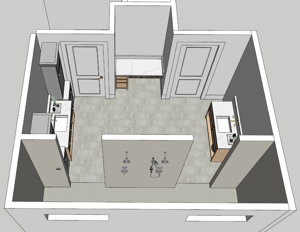
While these renderings give an incredible sneak peek into our main bathroom, they definitely don’t do the room justice. I cannot wait to see this room come together in real life so I can reveal the final product! Stay tuned!


Leave a Reply